Kluero
– Web & Brand Design
About
The science magic for team success. Kluero is an AI powered digital service for making teams more efficient and dynamic.
Team
Filip Söderlind, Amanda Larsson, Tony Hadders
My Role
UI Designer, Illustrations,
Creative Director, Webflow Developer
Tools Used
Figma, Lightroom, photoshop
The
Brief
The primary objectives were to create a new website and brand identity for Kluero. We were also asked to ensure a responsive design, incorporate the existing logotype, utilize the logo colors as the main color scheme, and achieve a tasteful, minimalistic aesthetic with playful elements. Additionally, a translation function for English, Swedish, and German was required to enhance accessibility.
Research
To gain insights into the industry landscape, we conducted thorough research, examining similar companies' websites. This exercise served to inspire our design while ensuring Kluero's uniqueness and differentiation. We observed that clarity and informativeness were top priorities, with ample whitespace and intuitive navigation.

The design elements reflected a modern and tech-oriented vibe, and animations were simple yet effective in enhancing user experience. Based on this we crated the stylescape seen below this block of text to lead us through the whole design-process.
Evaluation
Before commencing the design process, we conducted an evaluation of Kluero, identifying its strengths, weaknesses, opportunities, and threats. Notably, Kluero's utilization of AI positioned it as a trailblazer in its field, offering a truly distinctive product.
Structure and Art Direction
Using a flowchart, we mapped out the customer's journey through the website, ensuring all design components interconnected. Building upon this flowchart, we created a greybox prototype using Figma, incorporating colors, icons, text styles, and buttons. The font "Source Sans Pro" was selected for its modern tech aesthetic, with its larger x-height contributing to readability.
Content Creation
With the website structure and art direction in place, we proceeded to create the main content, including custom illustrations, icons, and a logo redesign.

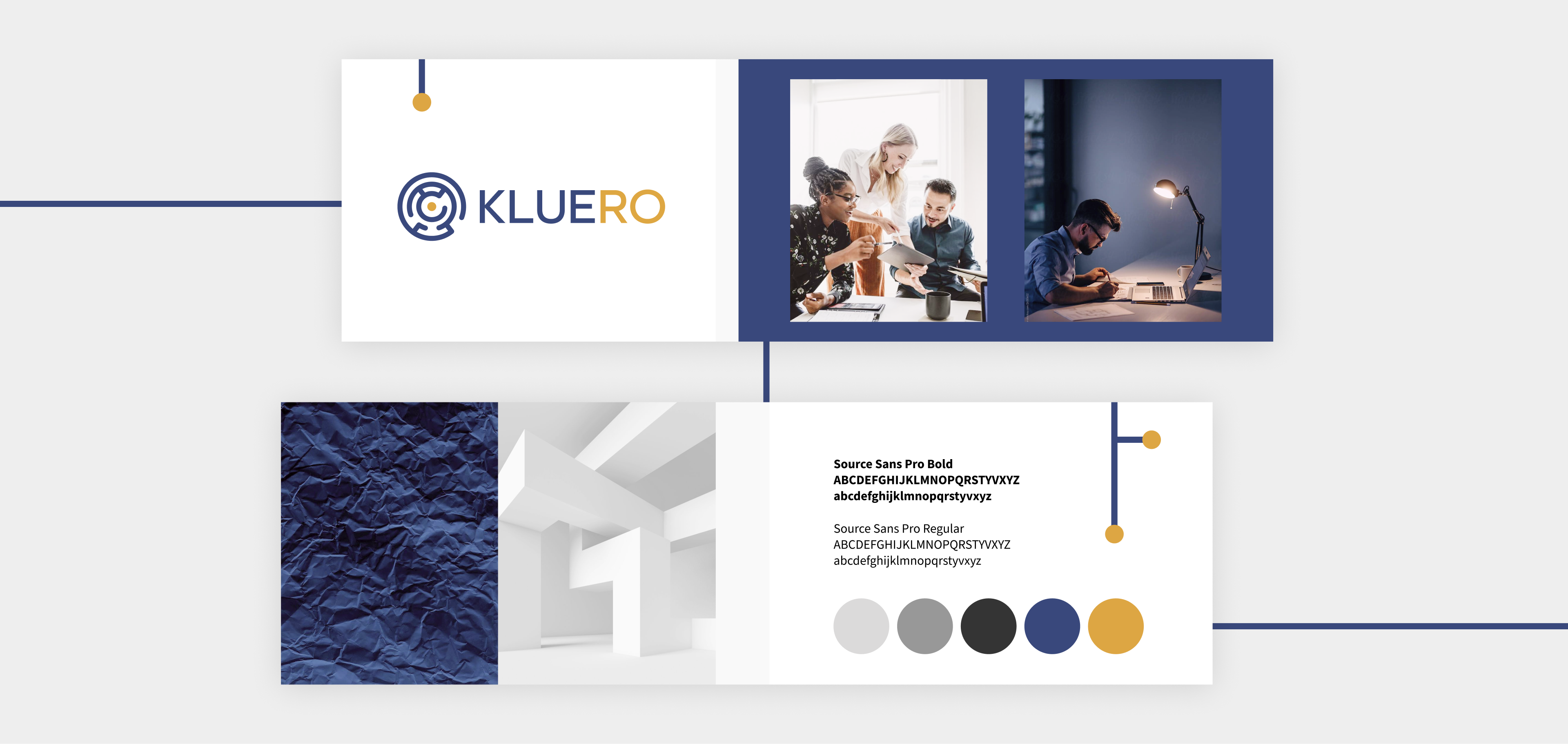
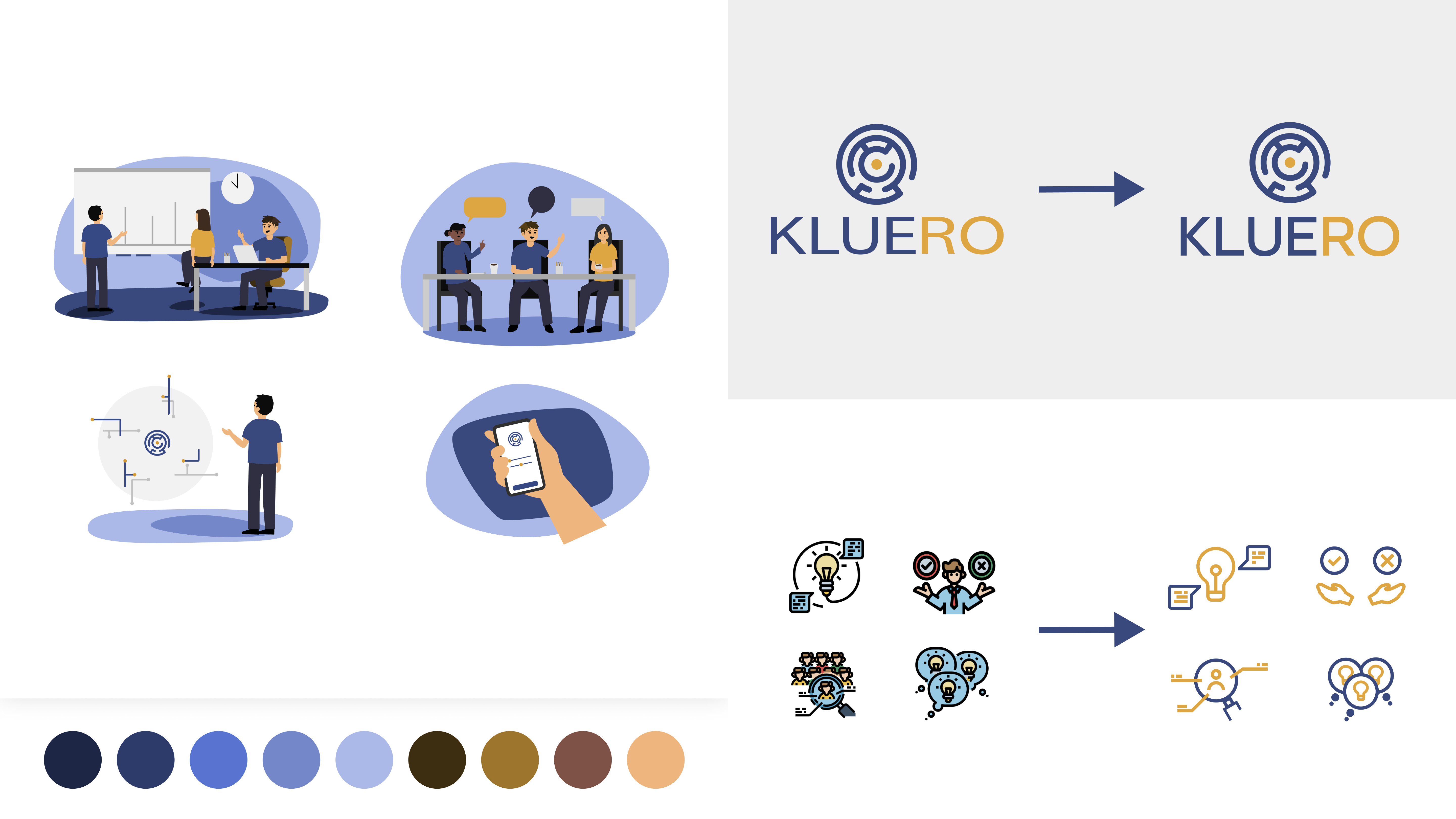
The previous website featured generic freepik illustrations, which we replaced with unique illustrations designed specifically for Kluero. These illustrations effectively conveyed Kluero's message while maintaining a clean aesthetic with vibrant splashes of color. Additionally, smaller illustrations accompanying informative text on the landing page were redesigned to align with Kluero's brand identity, incorporating the brand colors and adopting a more minimalistic approach. While the symbol in Kluero's logotype remained unchanged, we introduced a new typeface that harmonized better with the overall design elements, complementing the logo's shapes and lines.

Kluero also had a special request regarding one of their team members' pictures on the website. Due to her absence during the team photo session, they asked us to change the background in her photo. To ensure visual consistency, I edited the background using Photoshop and utilized Lightroom to make the final result appear as realistic as possible.
Outcome
The final product showcases a modern, clean, and professional design that strikes a balance between clarity and accessibility. With a touch of playfulness, it effectively conveys Kluero's mission. The website received an AAA accessibility score, ensuring an optimal user experience and exemplifying Kluero's commitment to excellence.
Image of Stripe payment processor website homepage